
Friday, 2 May 2014
Self Directed Statement
For my self directed project I wanted to look at light and it's effects on peoples mood and feelings, specifically artificial light such as neon. I started to look at light in an environmental sense, and how it can mix colours and forms shapes in an open room - but I soon decided I wanted more to focus on it's effects on people. I looked at scenes from films which rely heavily on using coloured lighting to convey a specific feeling. I wanted to look into this and did some research on colour theories. I decided to pick three strong, colours (Red,Blue,Yellow - traditional primary colours) and use them as lighting for a photograph each respectively. Initially I used theatre light gel on a lightbox as lightsource, but I soon found it wasn't powerful enough. Instead I used a lamp, positioned differently while I took photographs. I then manipulated them in Photoshop. Using these photos as a basis, I painted the images on canvases. I intend to display the 3 images together, each piece is titled after it's respective colour - it's up to the viewer to make up their mind how that specific colour makes them feel, or the impression it conveys.
Drawing Statement
For my drawing project I wanted to focus on people, specifically the face. Portraits are something I've never really done and from a purely fundamental level, is something I'd like to improve on. I didn't want to just draw faces and call it a day without doing something differently. I looked at a lot of portrait artists and illustrators and was influenced by their use of strong line in artists such as Oliver Kugler and Jesper Waldersten. When working I started the think that the portraits, which were all drawn from photographs I took, showed very subtle characteristics of the people they portray just with certain nuances. From this I wanted to go a little deeper and literally show who they are underneath and develop a skull and muscle structure for each portrait as a sort of medical examination. I decided to leave the hair on each portrait as a stylistic touch, it looks far more visually interesting that way I feel.
Friday, 25 April 2014
Portraits - Bone


The second layer of my drawing project, showing the bone structure underneath the skin on the face. I used the actual face as a guideline for the structure, using actual shape information to determine how the skull would look for each individual.
Portraits


The main portraits for my drawing project, each one is conveyed using only line to dictate shape, light and shade.
Self Directed - Paintings


The 3 colour paintings for the self directed project. The pictures aren't phenominal, but convey the idea of the work. I'm most pleased with the yellow one, by a long way. I think I may even prefer the photographs...
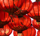
RED/BLUE/YELLOW


The photographs used as reference for the self directed paintings. I manipulated them in Photoshop to give them the impression of being affected by coloured light.


Physcological Properties of Colour
Source: http://www.colour-affects.co.uk/psychological-properties-of-colours
RED. Physical
Positive: Physical courage, strength, warmth, energy, basic survival, 'fight or flight', stimulation, masculinity, excitement. Negative: Defiance, aggression, visual impact, strain.
Being the longest wavelength, red is a powerful colour. Although not technically the most visible, it has the property of appearing to be nearer than it is and therefore it grabs our attention first. Hence its effectiveness in traffic lights the world over. Its effect is physical; it stimulates us and raises the pulse rate, giving the impression that time is passing faster than it is. It relates to the masculine principle and can activate the "fight or flight" instinct. Red is strong, and very basic. Pure red is the simplest colour, with no subtlety. It is stimulating and lively, very friendly. At the same time, it can be perceived as demanding and aggressive.
|  |
BLUE. Intellectual.
Positive: Intelligence, communication, trust, efficiency, serenity, duty, logic, coolness, reflection, calm. Negative: Coldness, aloofness, lack of emotion, unfriendliness.
Blue is the colour of the mind and is essentially soothing; it affects us mentally, rather than the physical reaction we have to red. Strong blues will stimulate clear thought and lighter, soft blues will calm the mind and aid concentration. Consequently it is serene and mentally calming. It is the colour of clear communication. Blue objects do not appear to be as close to us as red ones. Time and again in research, blue is the world's favourite colour. However, it can be perceived as cold, unemotional and unfriendly.
|  |
YELLOW. Emotional
Positive: Optimism, confidence, self-esteem, extraversion, emotional strength, friendliness, creativity. Negative: Irrationality, fear, emotional fragility, depression, anxiety, suicide.
The yellow wavelength is relatively long and essentially stimulating. In this case the stimulus is emotional, therefore yellow is the strongest colour, psychologically. The right yellow will lift our spirits and our self-esteem; it is the colour of confidence and optimism. Too much of it, or the wrong tone in relation to the other tones in a colour scheme, can cause self-esteem to plummet, giving rise to fear and anxiety. Our "yellow streak" can surface.
|  |
Thursday, 24 April 2014
Derek Cianfrance - Blue Valentine

These screenshots are from the movie Blue Valentine by Derek Cianfrance, I've looked at this scene as the coloured lighting is hugely significant to conveying a tone for the scene. The scene involves a married couple who have come to a seedy hotel in hopes of recindling something within their broken relationship. The colours have a distinctly cold, and clinical feel - highlighting the lovelessness of their relationship. The colour blue is often synonymous with sadness.
David Fincher - Se7en (Lust Scene)

In this scene from the David Fincher movie 'Se7en' - the two detective protagonist detectives investigate a murder at an extremely seedy brothel. The music is thumping and the surroundings saturated with red light throughout the scene. The colour conveys a sense of danger, but also represents sex which makes up the environment around them. It also conjures images of blood, which relates to the crime scene.
Subscribe to:
Posts (Atom)