Thursday, 24 April 2014

Oliver Kugler


These drawings of regular pedestrians by Oliver Kugler have interested me greatly. Rather than just traditional portraits, the artist takes into account their surroundings but also what they do and their daily routines. I think it's a really interesting way of interpreting people. I also really like the artists use of line.

Jo Ratcliffe - Stüssy


This is a piece Jo Ratcliffe did for New York streetwear brand Stüssy. I like the boldness of the work, how she's used just black on white to create something very high contrast and striking.

Self Portrait


This is a self portrait I created. I started by striping away the most minute of details, only keeping important structural or lighting information. Aside from the background, the piece is entirely comprised of black and white. The shading is created by using equal distanced lines in succession, this is a technique similar to halftone shading, which is a method used in very old printing techniques.

Jesper Waldersten


I was drawn to Walderstons strong use of line in his work, something I'd like to do with mine. He creates very striking imagery by warping and manipulating the subject, as well as choosing only to properly display certain elements. 

Jean Debuffet


Jean Debuffet is a very interesting artist in the way he segments the portraits into specific regions. This creates a form of structure in the faces. Despite stripping away several details they are still very recognizable and clear.

Nicolas Winding Refn - Only God Forgives


These are screenshots from the Nicolas Winding Refn film, Only God Forgives. Throughout the movie there is a heavy emphasis on lighting of different colours. This lighting is used to convey a feeling, from cold blue, through an uneasy and uncomfortable yellow to a dangerous red. The film is highly effective in its use of emotive colour.

Dan Flavin


Dan Flavin is an artist who's work I have already experienced in person (Link), I find his work interesting not so much for the installations themselves, but how they react with the viewers presence. A huge part of the work is how the colour changes the appearance of people in the space, and also how the colours mix and cast shadows and colours on the walls.

James Turrell


James Turrell's work is very effective in creating somewhat otherworldly environments. The use of colour combinations creates an unnatural environment. I like how the light reacts to the people viewing, incorporating them into the work - not just the lighting.

Atkinson Grimshaw

I really like these paitings by Atkinson Grimshaw. The way the light pierces through the murky night colours is very visually interesting I and creates a strong sense of atmosphere. You can feel the light as if it were a character in the works and not 'just' lighting.

I previously looked at another of Grimshaw's works here: http://greens13192474.blogspot.co.uk/2014/01/atkinson-grimshaw-liverpool-quay-by.html

Self Directed - Photos


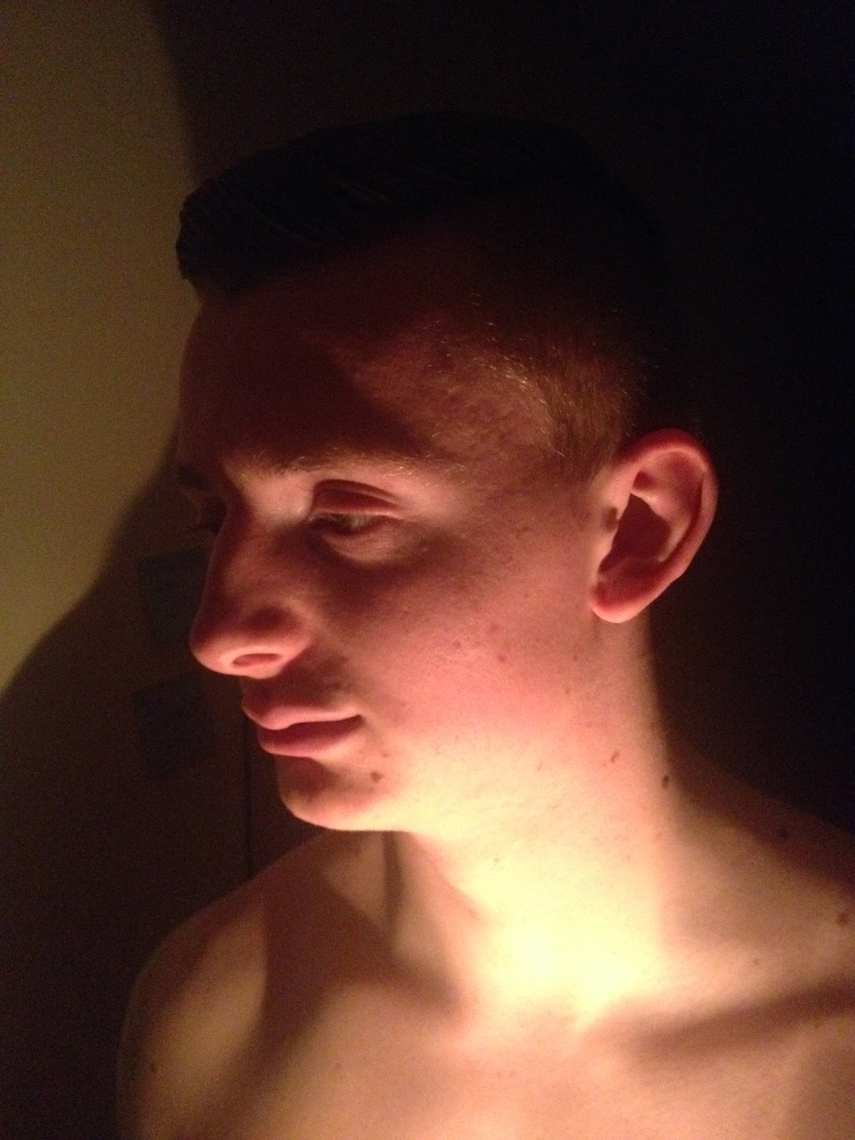
Photographs taken to use as reference for Self Directed work.